Making Everything Fit

This part of the design tends to be an iterative process: you start by sketching the rooms into the building shape you desire, then when it inevitably doesn't fit right, you change room sizes, and rearrange them and try again. To start assembling the puzzle1., all you need to know is what rooms you want, where you want them, and a rough idea of their size based on what is going in them.
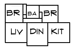
Since we've designed each room to be what it needs to be (see room layout section), they usually don't fit in any coherent shape at this point; instead the result is more likely to be similar to the sketch (right). This situation is typical, where the obvious solution for this example is to make the bedrooms and/or bathroom bigger until the whole thing makes a neat rectangle, then maybe to bump out the dining and/or bathroom to improve their daylight. Because of this, buildings almost always tend to grow as the design process proceeds, and if you want it smaller, you have to constantly work to push the size back down.
Obviously if your building is as as simple as the example (above), then the number of choices is small, and no matter which one is made, the result is also small. The problem becomes more challenging when there are additional rooms, say a small laundry area, a mud/entry, a third bedroom, a second bathroom, a large pantry, a walk in closet in one bedroom..ie all the things that modern homes typically want. This is where opportunity comes to shuffles spaces around to get the pieces of the puzzle to fit better: as a rule of thumb, the less shuffling you do, the larger the building will end up being. It is here where tradeoffs are made: a wall of cupboards in the hall can substitute for a walk-in pantry, a place to air-dry cloths might end up in the bathroom instead of the laundry area, and so on. It's also here that an experienced architect is likely to be able to make it all fit better than you can.
This point in the design phase is the time to include space for all the things that are often forgotten: extra storage, space for utilities (hot water, heater if there is any, ventilation system etc). Its also the point where putting every desire that isn't sacred on the table and being willing to consider alternatives tends to make a better building that also stays small. This is also the point where you being looking at how to put a roof over your space and whether the shape you have will satisfy your design aesthetic. It is also a good time to think about cost, particularly when the shape starts getting complex. As a rule of thumb, a simple building that is a bit larger than a complex one will cost less, use less energy and use less materials; but that must also be traded off again the issue of daylight and aesthetics as unbroken expanses of wall don't tend to look very good, plus there typically is a rhythm of shapes that looks best on the exterior. It is not unusual at this stage to have to start nearly completely over with a different set of assumption, as this stage is where you really have to examine your priorities.
Finally its also worth giving some thought on how the house will feel, particularly how "big" it feels. In this case "big" does not always correlate directly with measured size, but psychological size. To some degree this has to do with whether the size of the room easily accommodate the activities in it or not, and also the ceiling height. Having a few long views, for example by using a great room instead of a separate kitchen, dining and living rooms can help make all three spaces feel bigger. This is, of course, only important if you care, since feeling "big" isn't really necessary.
Simplicity
Simple buildings are easier, and hence cheaper, to build than complex ones.
They generally also use less material, primarily because there is less cutoff
waste and less bracing for each corner. The tradeoff is that a box (the simplest
shape) can't always meet the other design needs of the building.
Buildings whose shape is determined largely from aesthetic concerns tend to be more expensive to build and less functional than ones built for functional reasons with aesthetics in mind.
Notes
1: this method presented here is not the typical design method, which starts with an exterior shape idea driven by aesthetics and/or simplicity and forces rooms into the space. Also, the problems here are all driven by keeping the building size down: something that was often done in the past, but is not as common now.
